Learning Objectives:
You will be able to identify what a Responsive Design Framework is and why you would use one.
You will be able to identify what the difference between a regular and responsive design of a website.
Homework:
Post: Responsive Design Website (using Bootstrap or W3.CSS) into your Webspace. Make sure that the site is linked off your homework page. The site needs to have 4 pages with graphics and links to an external site. Pay attention to the layout of the content. You can use a Brackets, Dreamweaver or another HTML editor
Post: A review of Bootstrap or W3.CSS under Discussions > Responsive Design
Read: Responsive Design using CSS
Read: W3schools Bootstrap plus Templates or W3.CSS plus Templates
Watch: Bootstrap Video (if you are using Bootstrap)
Watch: W3.CSS Video (if you are using W3.CSS)
Watch: Responsive Design
Topics Covered:
Bootstrap 3 is mobile-first framework that is designed to be responsive to mobile devices.
Bootstrap Setup
Step 1. add the following <meta> tag inside the <head> element:
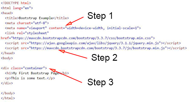
<meta name="viewport" content="width=device-width, initial-scale=1">
The width=device-width sets the width of the page to follow the screen-width of the device (which will vary depending on the device).
The initial-scale=1 part sets the initial zoom level when the page is first loaded by the browser.Step 2. add links to Bootstrap CSS and Javascript
The links can be to local files or the online files. Local files are better because you can customize and you don't have to rely on a remote site being available.
Step 3. Create Containers
Bootstrap also requires a containing element to wrap site contents. There are two container classes to choose from:
- The .container class provides a responsive fixed width container
- The .container-fluid class provides a full width container, spanning the entire width of the viewport
Note: Containers are not nestable (you cannot put a container inside another container).
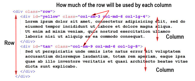
Step 4. Create Rows
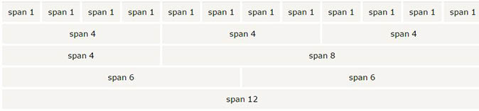
Bootstrap's grid system allows up to 12 columns across the row (page.)
You will be modifing Classes to create the desired layout and responsiveness using the Grid.
Grid Classes (The Bootstrap grid system has four classes)
- xs (for phones)
- sm (for tablets)
- md (for desktops)
- lg (for larger desktops)
The classes above can be combined to create more dynamic and flexible layouts.
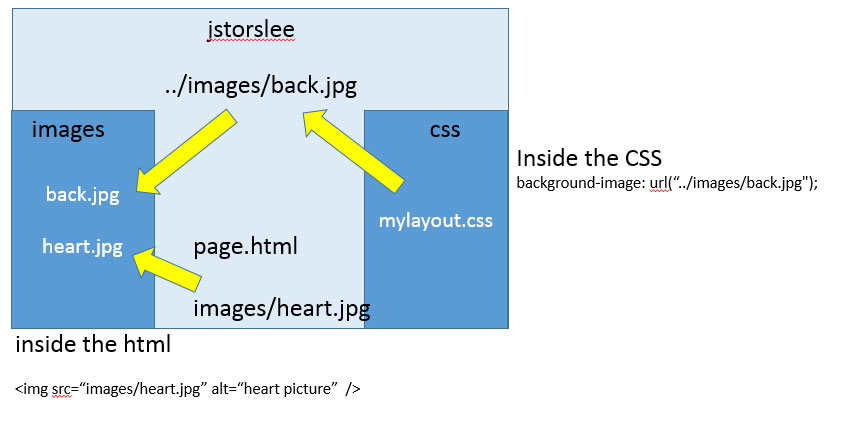
Placing Files Locally
Terms:
Templates, CSS3 and Generators
Dr. Jon Storslee
Phone: 602-787-6734
