Wikipedia
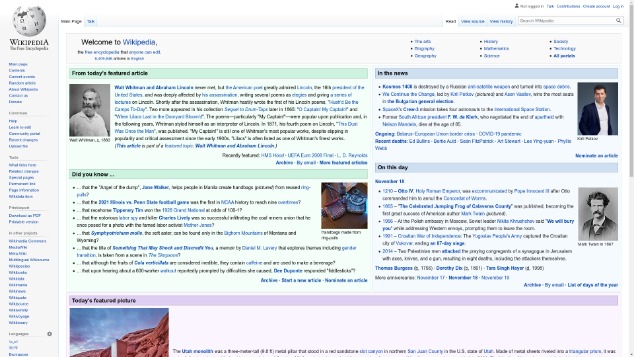
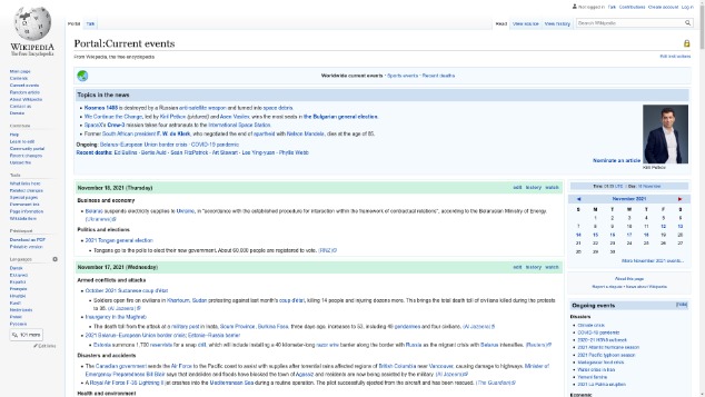
While intitially Wikipedia seems to be a well designed site both from a visual and layout standpoint, with a lovely black on white gestalt presentation and clearly labled sections for a multitude of options; first glances, to me, are the only good impressions the site makes. From there the site descends into a very obvious example of information overload and the default size of the font and the sheer amount of words presented at all times contributes to a feeling of visual white noise that I couldn't escape as I perused the site. Why does the home page present every single language in a sidebar instead of a dropdown at the top or bottom of the page? Why does it list sister sites like Wikivoyage and Meta-wiki, without description as to what these site are? Why does the website for all intents and purposes not have adequate mobile support? These questions and more kept piling up in my head until I came to the realization that issues like this are the reason why my utilization of this site has waned over the years, until like now, I only visit it for the point of critique or review and no longer for the joy I used to in my youth when these issues would have flown past me like leaves on the wind.