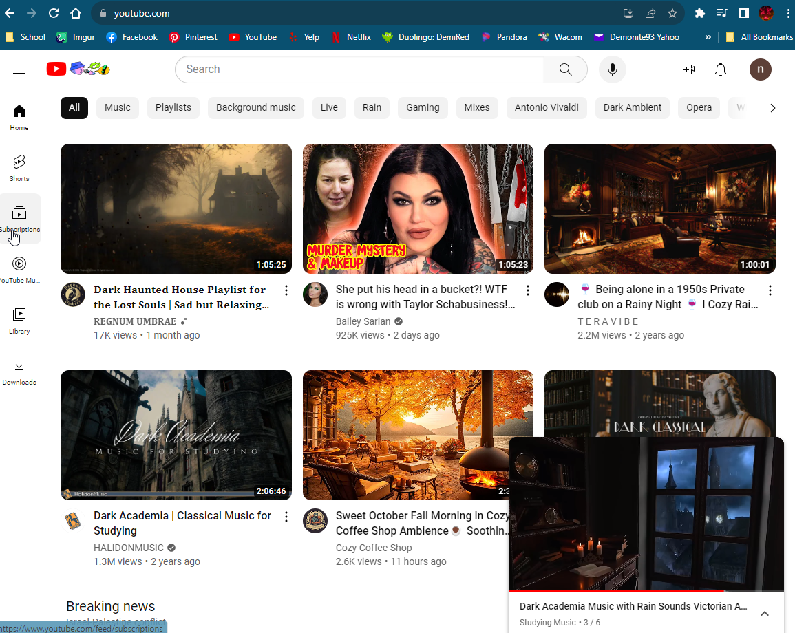
To be honest YouTube is one of my all time favorite websites. The wealth of entertainment, learning, and complete randomness makes for hours of entertainment. From a technical perspective the website is clean and user friendly. You can easily find your saved videos as well as a list of video recommendations based on what you have watched in the past. The search feature makes it easy to look for anything as it will even review the summaries of videos for key words in searches. I have searched for an found videos based on specific verbiages from the videos. I rarely have loading issues even with all the images from the videos displaying all at once. The ability to get alerts on specific creators so you know when new videos are out is also wonderful. You never have to worry about missing something. All in all never had an issue with this site and its barely changed in the handful of years since I started using it, because it didnt need to. The design is simple and easy for any user.
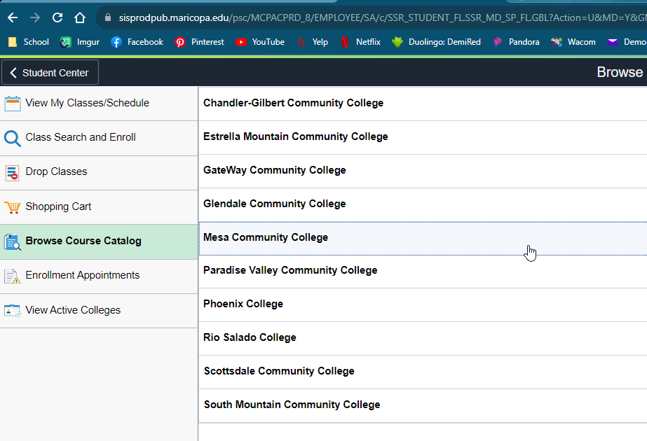
For this section I had to really think about what websites have I visited and just disliked immediately. Or what websites have I visited and had a hard time using. The very first one that came to mind was the Student Center website for Maricopa County Community Colleges. More specifically the Course Catelog page. While the page is simple in design and appears to be user friendly, the ablity to search for courses is not. As someone who works full time I have to cater to my work schedule and sometimes have to go to other campuses to get needed courses at specific times. The update to this page makes it to where you cannot just search for a specific course across all of the schools. So if you cannot find it at your primary school you have to back out and try to find it somewhere else, essentially restarting the search every single time there is a change. Its not intuitive and you have to make multiple clicks to get anywhere. The website regularly take 10 - 20 seconds to load a search even though you are refined down to a specific semester and school. The site design and how it functions reminds of someone who doesnt use the system trying to anticpate the users without any input from actual users. There are side menus that are missing key elements for searches, for example the location of the course (online or onsite) and hitting the back button to go back to a search results page moves you back to the very begining of the process. It was incredibly frustrating trying to figure out courses and how to manage the times of the classes, locations, and other needed info. I preferred how it was before where you could search by either a specific subject or a very specific class. In fairness none of these makes this a "bad" website per se just one that I dont look forward to using. Truely "bad" websites are harder to come by these days.